The problem
The numbers on GCC diversification are scattered across the World Bank, UNCTAD, Oxford Insights, WIPO and six separate national sources. Each uses its own format, years and definitions, so nobody can compare the six countries without cleaning it all first.
What I built
- I pulled the data from those sources, cleaned it and joined it into one table by country and year, with every derived figure documented.
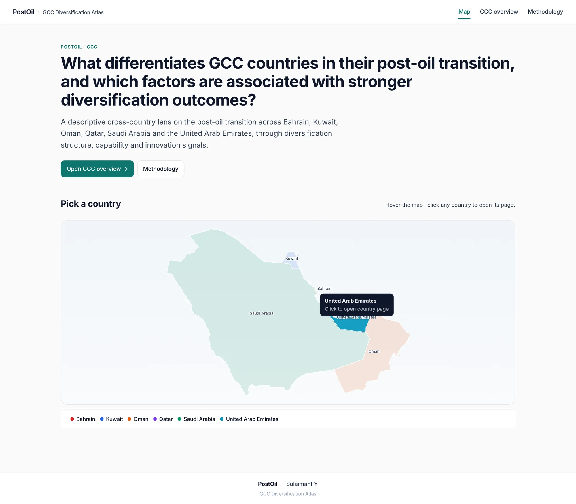
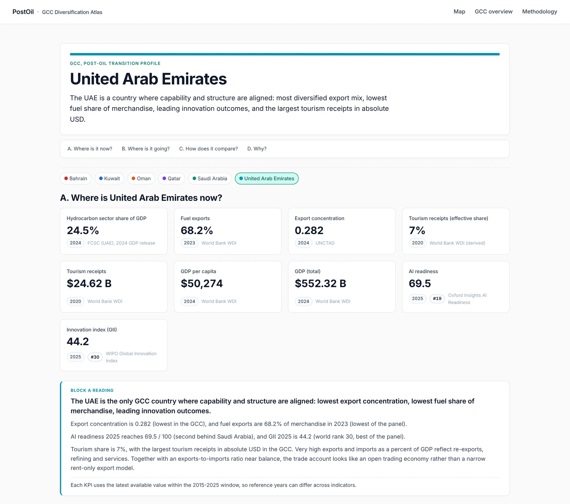
- A build script turns that table into data for a live website: a clickable GCC map, an overview comparing all six countries, and a page per country answering four questions: where it is now, where it is going, how it compares, and why.
- A methodology page lists every source and rule, with links. Every update to the code or data republishes the site automatically.
The result
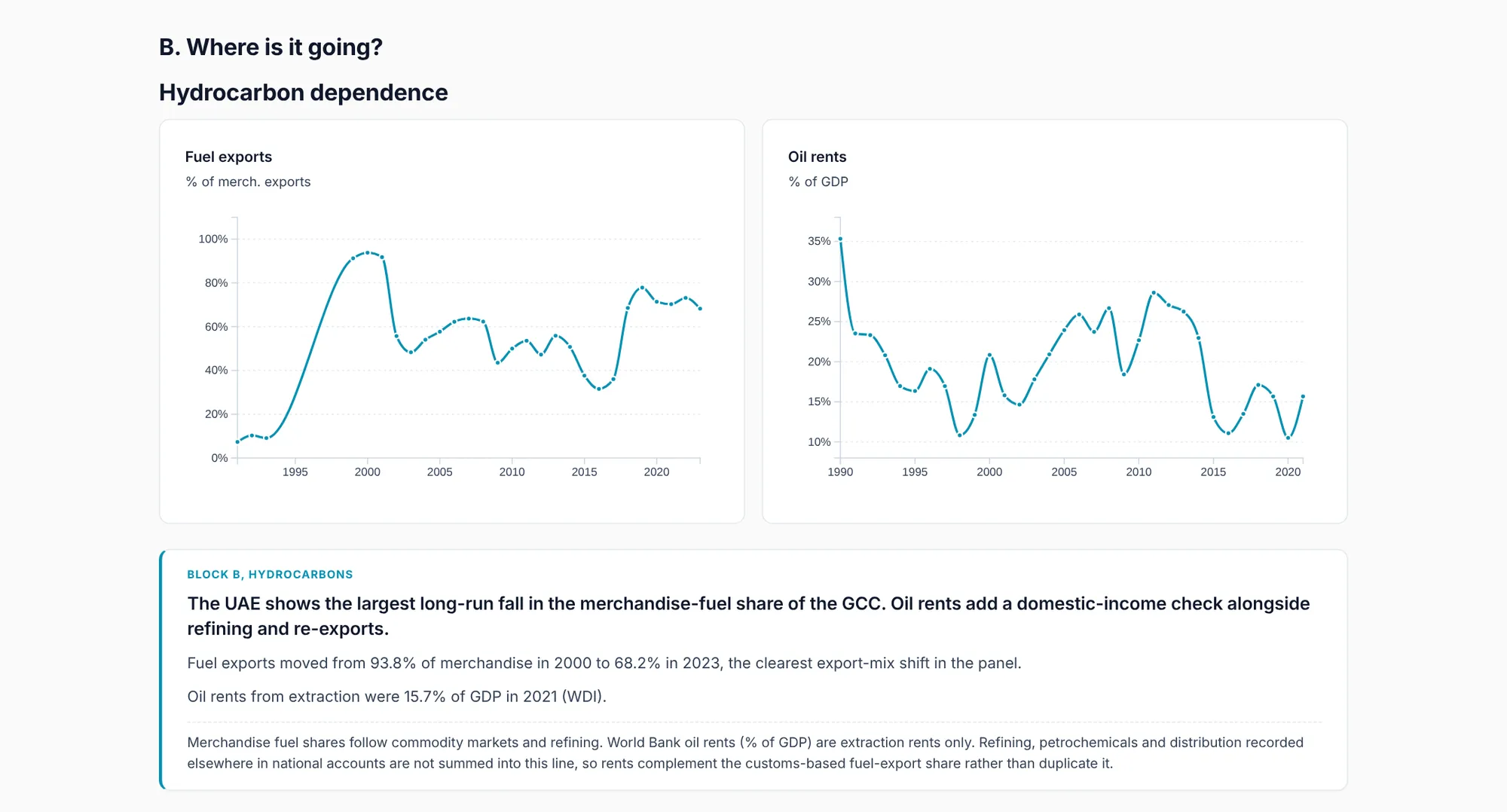
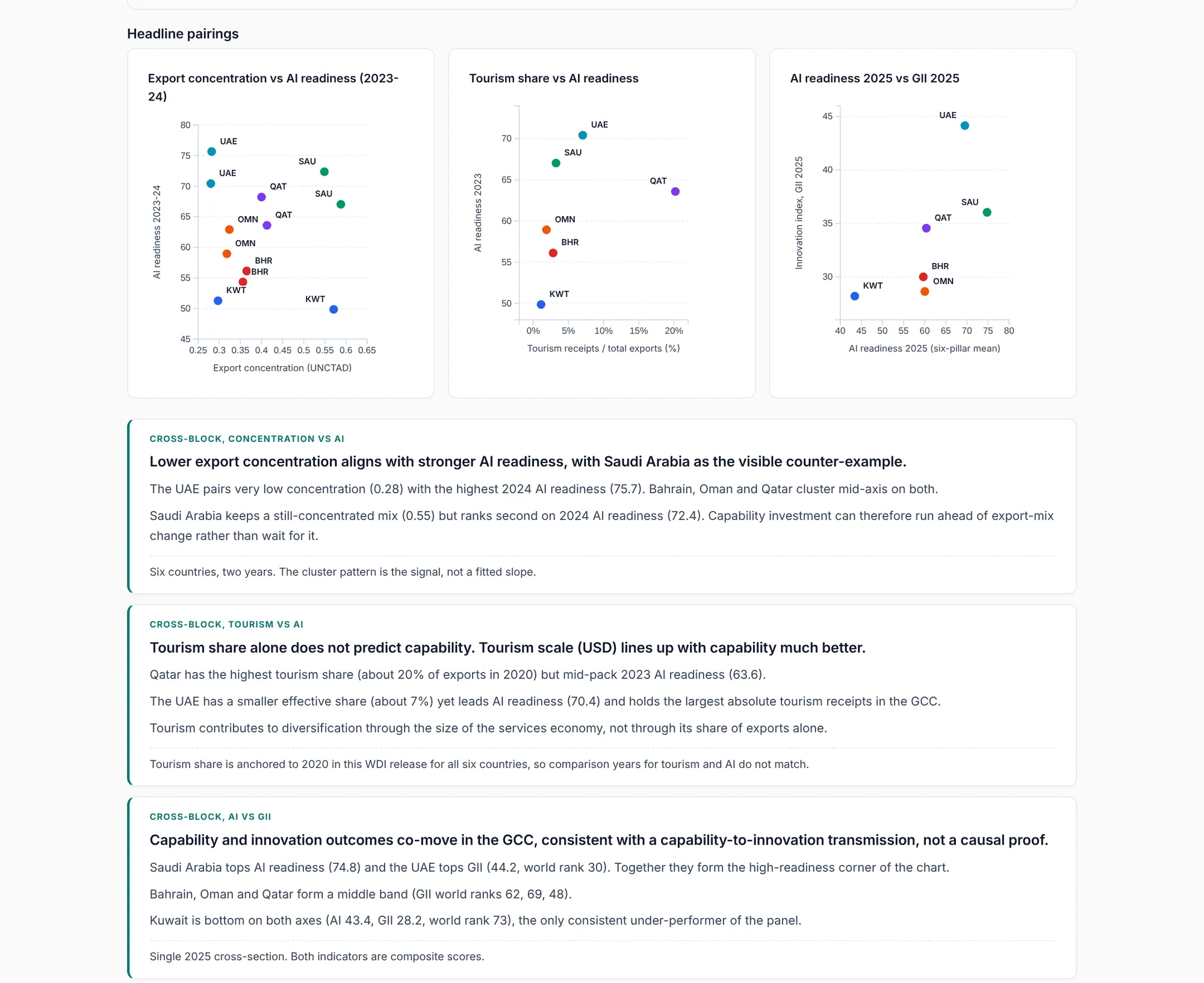
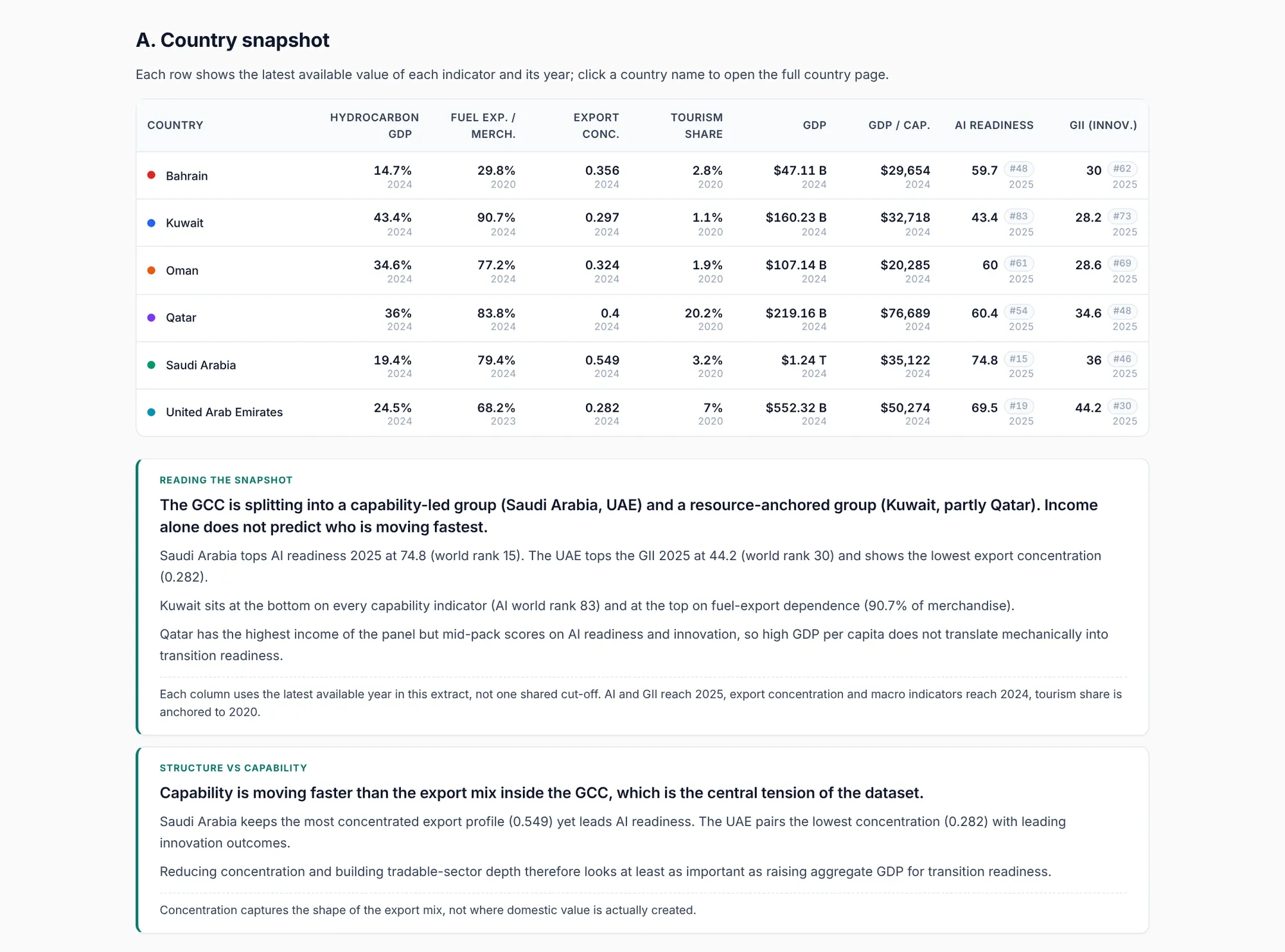
A public site covering Bahrain, Kuwait, Oman, Qatar, Saudi Arabia and the UAE, with indicators on oil dependence, trade, tourism, AI readiness and innovation.
One clear reading: in 2024 the hydrocarbon sector was 19.4% of GDP in Saudi Arabia and 24.5% in the UAE, against 43.4% in Kuwait. It is descriptive on purpose: with six countries, it shows contrasts and trends, not causes.
How a business would use it
Most companies have the same problem with their own data: sales, stock, finance and operations sit in separate spreadsheets and systems. I pull it into one clean, documented dataset and give managers a dashboard they trust, refreshed automatically. For a business in the Gulf, I already know the regional public data sources.
- Management dashboards across branches and systems
- Automated weekly and monthly reporting
- Market and competitor data for GCC expansion
- Data audits before an AI project